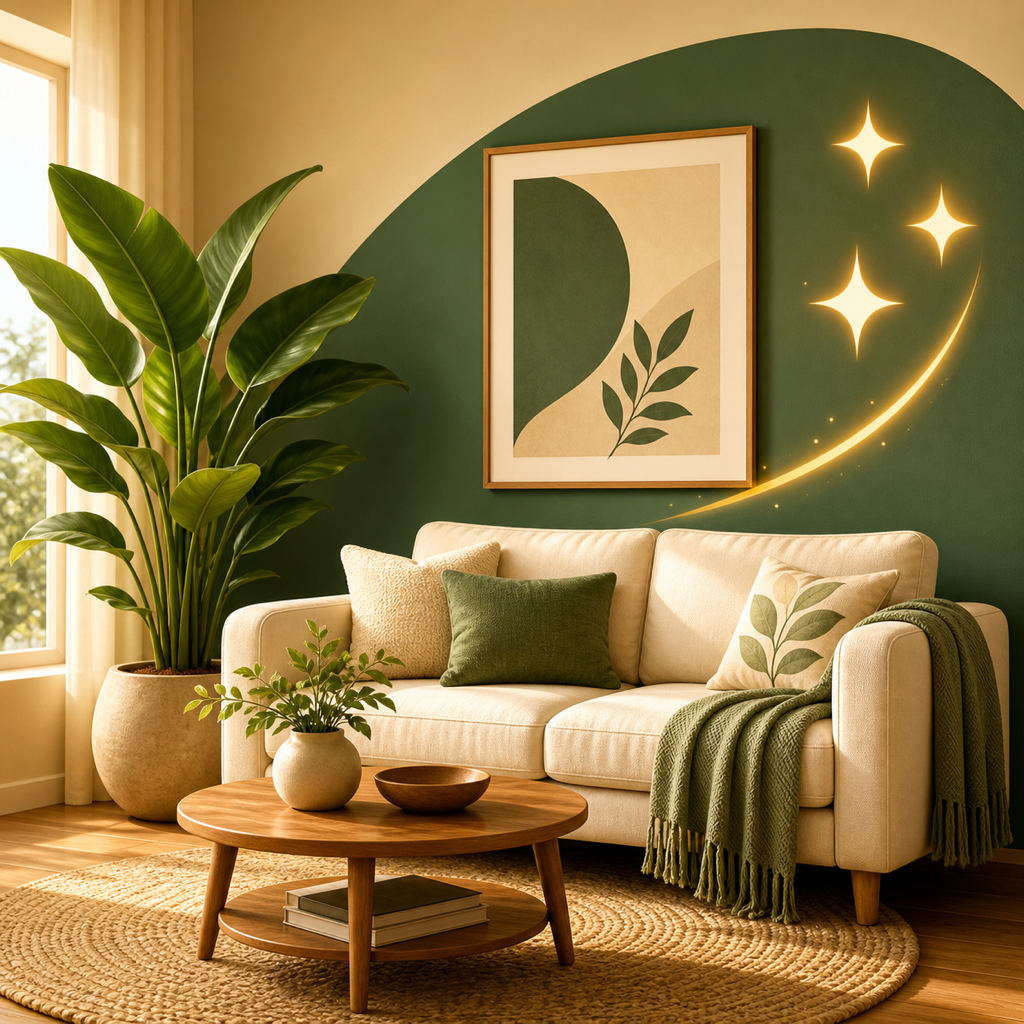
Two questions usually narrow an empty-room style to two or three options: whether you want a little on show or a lot, and whether you lean warm and natural or sleek and polished. Compare that shortlist on the same room photo before you buy anything.
Pick a style by answering two questions first
Two questions narrow the field. Do you want a little on show or a lot (minimal versus layered)? Do you lean warm and natural or sleek and polished? Your answers usually leave two or three styles.
Feel matters more than look, though the two tend to answer each other. An empty room is a good place to test that, because nothing competes with the style you picture.
Here are the eight directions, each with what makes it distinct and who it suits.
- Modern: open plans, pale walls, glass and steel, with function leading. It suits people who want a simple, uncluttered room. Modern gets called cold or sterile, but it is rooted in breaking things down to simple, fundamental elements. It also differs from contemporary, which means whatever is current.
- Scandinavian: light wood, white walls, soft textiles and plenty of natural light. It suits compact rooms and anyone who wants calm without a stark feel. It's also a typical mid-budget direction.
- Bohemian: layered patterns, textures and colors, natural materials, plants and objects from travels and markets. It suits people on a tighter budget who like DIY and want a lot on show.
- Industrial: exposed brick, ductwork, concrete and steel, softened with leather, wood and textiles. It suits people who like a raw, urban look. Concrete and metal are hard surfaces, so weigh that against how your room will be used.
- Japandi: Japanese wabi-sabi, the idea that there is beauty in imperfection, meets Scandinavian functionalism. It suits people who want a considered, restrained room, and it works well in compact spaces by maximizing light and cutting clutter.
- Minimalist: fewer objects, hidden storage and a restrained palette. It suits people who want a little on show and prefer to let the room itself lead.
- Luxury: one of the presets you can try on your own photo. A bigger budget also opens up options like Mid-Century Modern or Contemporary.
- Mid-Century Modern or Contemporary: a bigger budget opens up these options. Contemporary refers to current trends, so it suits people who want a look that's of the moment.
How to mix without making a mess
Mixing works when the palette stays consistent. Limit it to 3 to 4 tones. Too many styles at once is a common source of visual clutter and confusion, so keep the secondary style to accents.
A decision path
- Answer the two questions: minimal or layered, warm or polished.
- Match your answers to two or three styles above. As a rough guide, a layered, warm answer may lean toward Bohemian, a minimal, warm one toward Scandinavian or Japandi, and a minimal, polished one toward Modern or Minimalist.
- Check room size and budget. Compact rooms favor Scandinavian and Japandi, tight budgets favor Bohemian, and bigger budgets open up Luxury.
- If two styles tie, use about 70% of a dominant style for walls, main furniture and flooring, and up to 30% accents through lighting, textiles and a few statement pieces.
How to compare styles on one photo
Take one photo of your empty room and view each shortlisted style on it side by side. RoomRevamp restyles an uploaded photo in presets or from a text description and keeps your walls, windows and light, with side-by-side compare.
Before you shop, work out the ideal size of rugs, sofas, dining tables and beds. For a fuller walkthrough, see how to preview an empty living room furnished.
FAQ
How many styles should I compare?
Two or three. Use the two questions to cut the list down, then compare only those.
Can I mix styles in one room?
You can, as long as the palette stays consistent. The 70/30 split gives you a simple structure.
What if I feel stuck at the start?
Starting is where many people get paralyzed. Pick a shortlist and test it rather than choosing in the abstract.